
Choosing the Perfect Limewash Colour for Every Room
Discover how natural light, room orientation, furnishings and atmosphere influence limewash colours and how to select the perfect shade for every space.
Choosing a wall colour is never only about finding a shade that looks beautiful on a colour card. Light, room size, orientation, furnishings and the atmosphere you want to create can all affect the final result. With limewash, these factors become even more important because its natural tonal movement responds continuously to changing daylight.
Unlike a completely flat paint finish, limewash creates subtle variations in colour and texture. A wall can appear brighter in the morning, softer in the afternoon and more atmospheric under warm evening lighting. This is part of its beauty, but it also means that choosing the perfect limewash colour requires a little more thought.
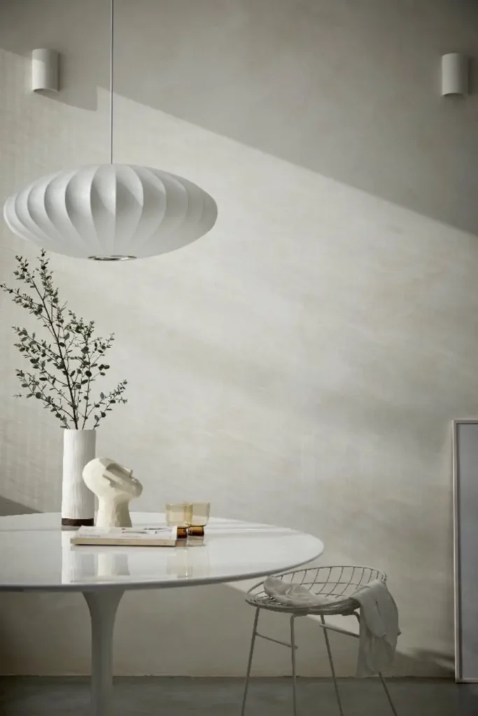
Before selecting a colour, observe how daylight enters the room at different times.
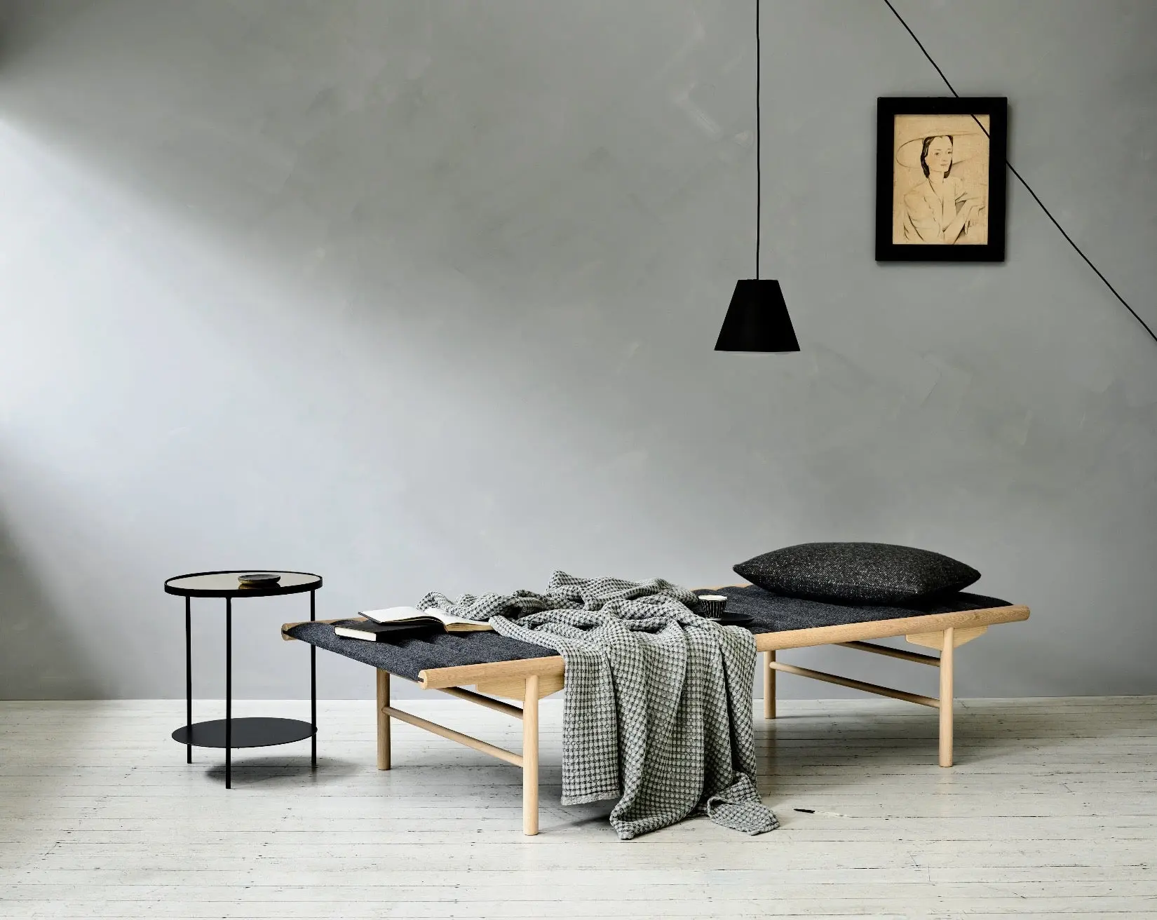
North-facing rooms usually receive cooler, more diffused light. Cool greys or blue-based neutrals may appear colder and slightly darker in these spaces. If you want the room to feel warmer and more inviting, consider creamy off-whites, warm greiges, pale clay shades or soft beige tones.
South-facing rooms generally enjoy stronger, warmer light throughout the day. They can support both light and deeper colours. Chalky whites and sandy neutrals will feel bright and airy, while terracotta, olive, ochre or earthy brown can create a richer and more enveloping result.
East-facing rooms are brightest in the morning. Soft neutrals, gentle greens and warm mineral shades work beautifully with early sunlight. West-facing rooms become warmer later in the day, allowing dusty pinks, muted terracottas and golden neutrals to develop a particularly atmospheric glow.

The living room is usually one of the most versatile spaces in the home. The right colour should complement the furniture, flooring and natural materials already present.
Warm neutrals are a safe but sophisticated choice. They pair naturally with timber, linen, stone, rattan and handmade ceramics. If you prefer a more distinctive look, muted olive, clay or mineral grey can introduce depth without overwhelming the room.
Consider how you use the space. A bright family living room may benefit from a light, fresh shade, while a room designed for evening relaxation can support a darker and more dramatic colour.
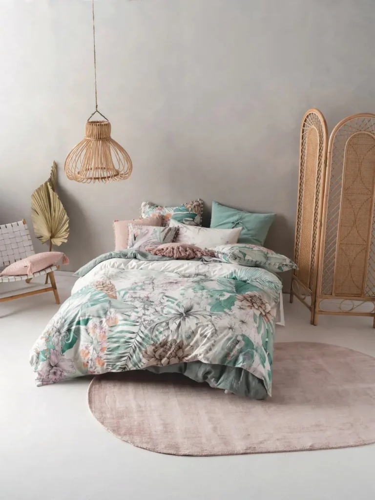
Bedrooms usually feel most restful when the palette is soft and cohesive. Warm whites, chalky beige, muted blush, gentle sage, and quiet greys can create a peaceful backdrop without making the room feel plain.
For a cocooning effect, do not automatically limit deeper colours to one feature wall. Applying a muted shade throughout the room can produce a more balanced and immersive atmosphere. The natural movement of limewash keeps the surface visually interesting, even when a single colour is used across several walls.
Always consider the undertones of the bed linen, curtains, flooring and upholstered furniture. A neutral wall may have warm, cool, pink, yellow or grey undertones that become more visible when placed beside other materials.
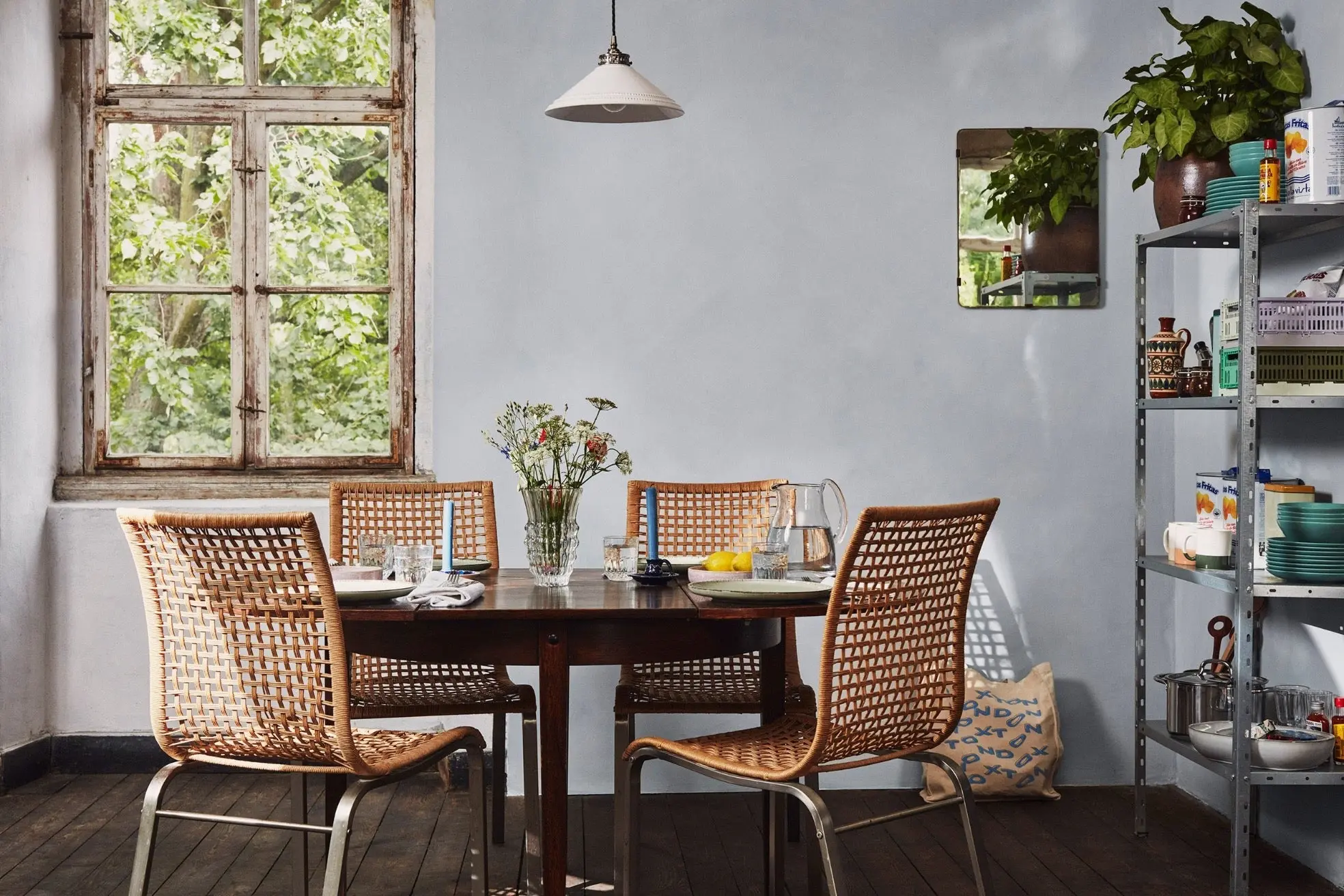
Kitchens are influenced by cabinets, worktops, splashbacks, flooring and metal finishes. The wall colour needs to connect these elements rather than compete with them.
Warm off-whites and pale mineral neutrals suit kitchens with timber or natural stone. Soft grey and blue-grey can work well with modern cabinetry, while muted olive, ochre and earthy shades create a welcoming Mediterranean feeling.
In a dining room, deeper colours can feel especially effective. Terracotta, warm brown, olive green or rich mineral neutrals help create an intimate atmosphere and look beautiful under pendant lights and candlelight.
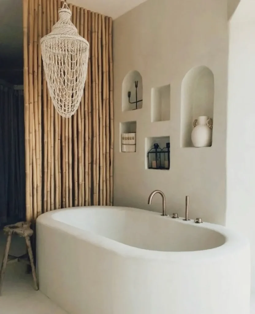
Small rooms do not always need to be painted white. A pale colour can make the space feel open, but a deeper shade may give a small bathroom, hallway or powder room greater personality.
In bathrooms, consider both the colour and the suitability of the complete wall system for the surface and level of moisture. Preparation, substrate compatibility and ventilation remain essential. Areas exposed to constant direct water require an appropriate finish designed for that specific use.
If several rooms are visible from the same point, their colours should create continuity. They do not need to match, but they should share a related undertone or level of softness.
For example, a warm off-white hallway may lead naturally into a sandy living room and then into an olive dining space. Repeating similar materials, such as pale stone, warm timber or natural linen, will make the transition feel even more intentional.
Screens and printed colour cards can inspire, but they cannot reproduce exactly how limewash will appear on a particular wall. The surface beneath it, the preparation system, the application technique and the light within the room can all influence the finished colour.
Apply a proper sample to the intended surface or to a suitably prepared movable board. Make the sample large enough to show the limewash’s tonal movement. Observe it in morning, afternoon and artificial light, and place it beside the room’s permanent materials.
The perfect limewash colour is not necessarily the most fashionable shade. It is the one that works with the architecture, light and character of your home. When chosen carefully, limewash does more than add colour: it creates depth, movement and an atmosphere that changes beautifully throughout the day.