

Limewash Paint & Light: Why Colour Changes in Your Space
Why does a limewash colour look different on your wall? Discover how natural light affects colour and how Colour Cards and 250 ml samples can help you choose with confidence.
Choosing a colour is one of the most important decisions when designing an interior, and with limewash it deserves particular attention. Limewash colours have natural depth, subtle tonal variation and a unique relationship with light. As a result, the same shade can look noticeably different from one room to another and can even change in appearance on the same wall throughout the day.
A colour that looks perfect in a photograph or on a screen may develop a different character when applied in your own home. This is not a disadvantage of limewash. In fact, it is part of what makes the finish so distinctive. However, it also means that choosing the right limewash paint colours involves more than simply selecting your favourite shade online. The most reliable way to make a decision is to see how the colour responds to the actual light, materials, and surroundings of the room where it will be used.
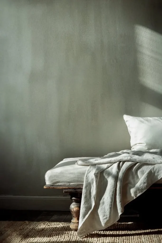
Natural light strongly influences how we perceive colour. A bright room with abundant daylight can reveal different qualities in a shade compared with a darker space with limited natural light. The direction of the windows, the time of day, and artificial lighting all play a role. Surrounding elements, including flooring, furniture, fabrics, and other wall colours, can also subtly change the way a colour is perceived.
The surface itself matters too. Limewash is known for its natural tonal movement rather than a completely flat, uniform finish. As light moves across the textured surface, different areas can appear lighter or deeper, giving the wall its characteristic sense of dimension. A warm neutral, for example, might appear predominantly beige in one room while revealing cream, grey or earthy undertones under different lighting conditions.
This is why natural light and paint colour should always be considered together. Look at a potential colour in the morning, at midday and later in the afternoon. Then look again after sunset under the artificial lighting you normally use. A shade that feels perfect at one time of day may have a noticeably different character several hours later.
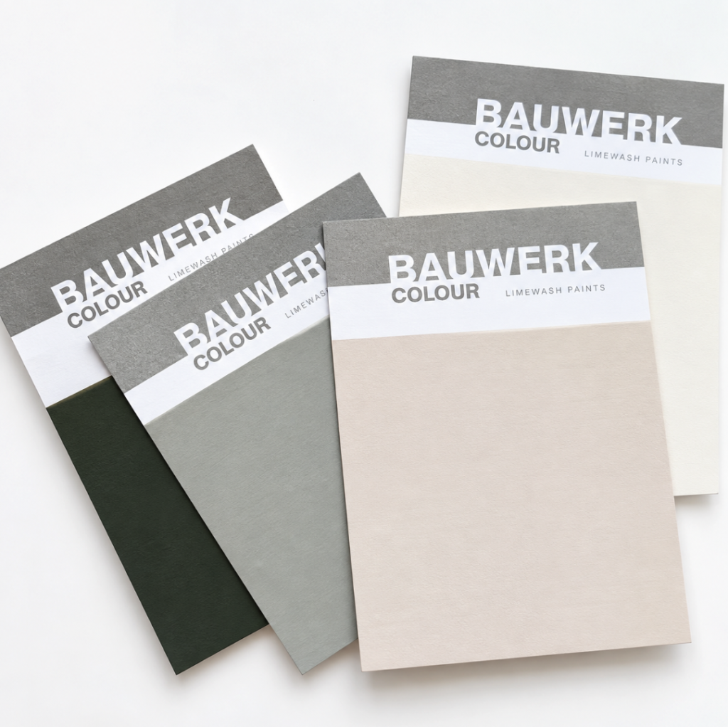
Colour Cards are an excellent starting point when narrowing down your choices. They let you compare several limewash colours in the actual room and place them alongside flooring, furniture, fabrics, and other finishes. For example, if you’re deciding between warmer and cooler neutrals, seeing the Colour Cards in your own environment can make it much easier to identify which direction works best.
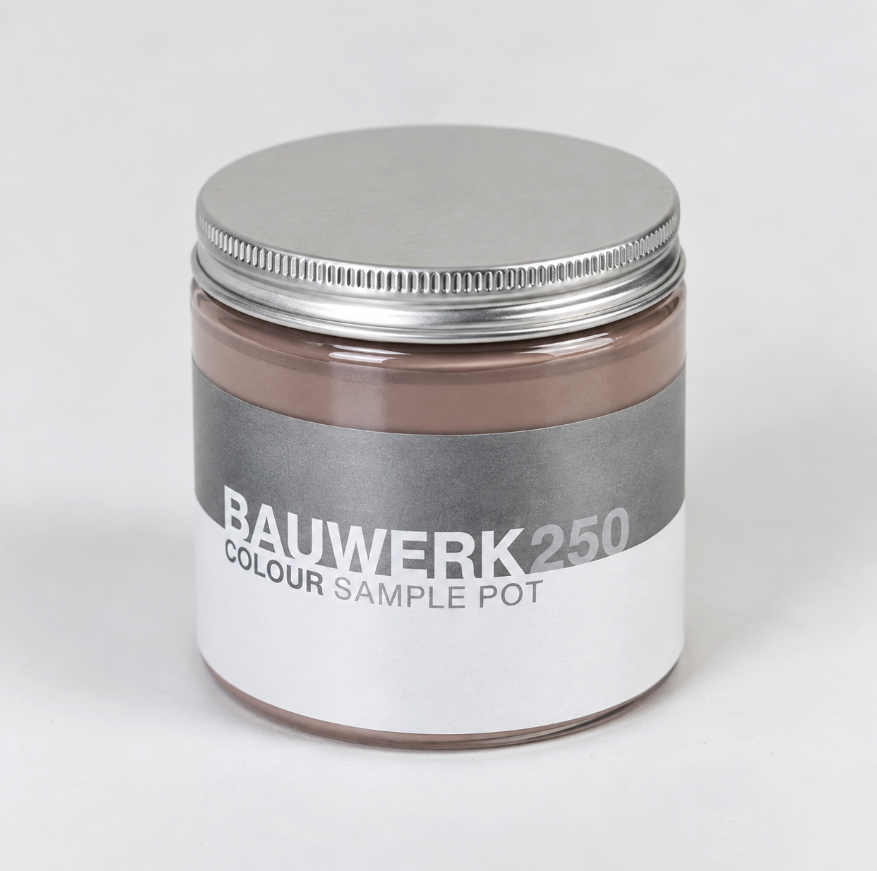
Once you have narrowed your selection to two or three favourites, a 250 ml sample offers an even more accurate way to evaluate the colour. Applying the actual product allows you to experience not only the shade itself but also the characteristic movement and tonal variation of limewash. Rather than painting a very small patch, create a reasonably generous wall paint sample so that you can observe the colour properly from different distances and under changing light. Leave it in place and look at it several times throughout the day. This simple step can prevent choosing a colour based on lighting conditions that only occur for a few hours.
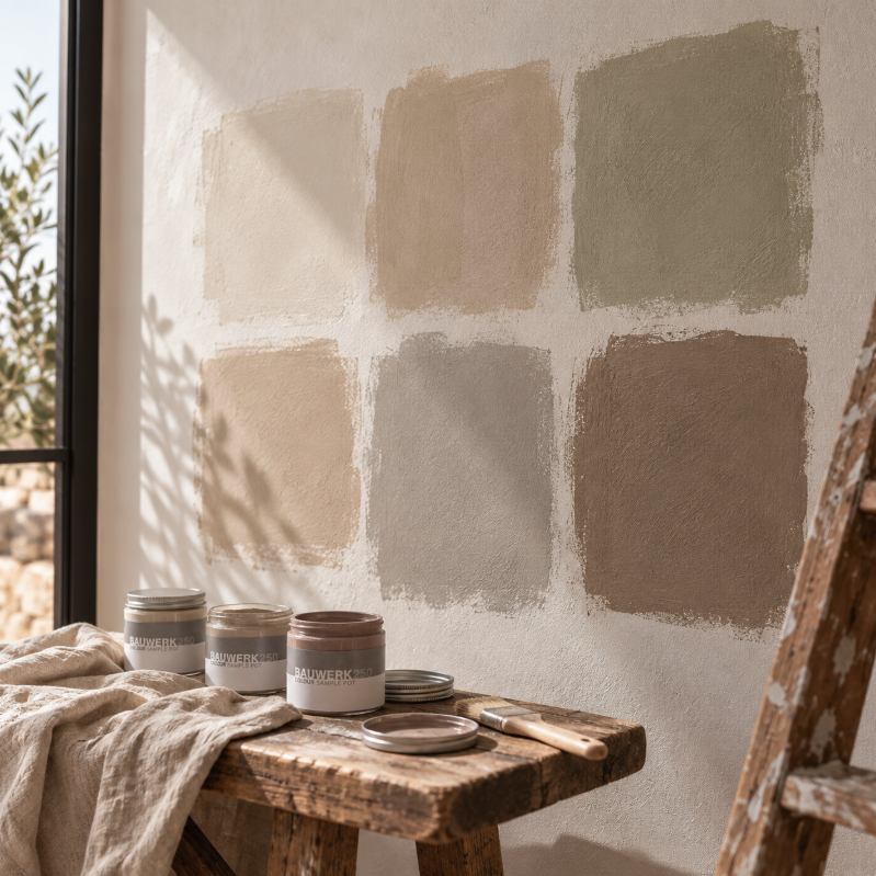
Interior photography and digital imagery are excellent sources of inspiration, but they cannot reproduce exactly how a colour will appear on your own wall. Screen settings, photographic editing and differences in lighting can all influence the way a shade appears online.
When choosing between limewash paint colours, use inspiration images to establish the overall direction you like, then use Colour Cards to create a shortlist. Once you have identified your strongest options, testing them with 250 ml samples allows you to make the final decision based on the actual conditions of your home rather than an image on a screen.
Limewash is a dynamic finish that interacts with light, architecture and surrounding materials. The perfect shade is therefore not simply the colour that looks best on a colour chart or in a photograph. It is the one that works naturally with the light, proportions, materials and atmosphere of your own space. Taking the time to test before committing can make the difference between choosing a colour you simply like and creating a finish that genuinely transforms the room.