
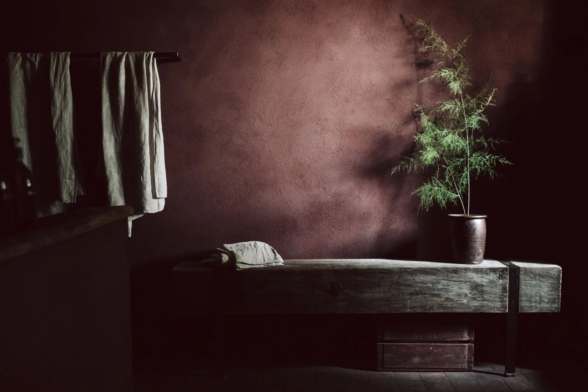
Top Autumn Limewash Colour Trends
Autumn limewash trends highlight warm, earthy shades and natural textures that create atmospheric, timeless interiors.
Autumn 2026 interiors are moving towards colours that bring warmth, calm and a stronger connection to nature. Cool greys are giving way to more complex earthy shades: greens with brown undertones, weathered terracottas, ochres, warm browns and deep natural neutrals. This palette is perfectly suited to limewash, whose subtle tonal movement and soft matt texture give walls depth, variation, and a distinctive sense of life.
This season’s leading limewash colours are more than a short-lived decorating trend. Inspired by soil, autumn leaves, timber, clay and ripe fruit, they create rooms that feel both contemporary and timeless. Below are the key colour directions for autumn 2026, together with shades that can bring each look into the home.
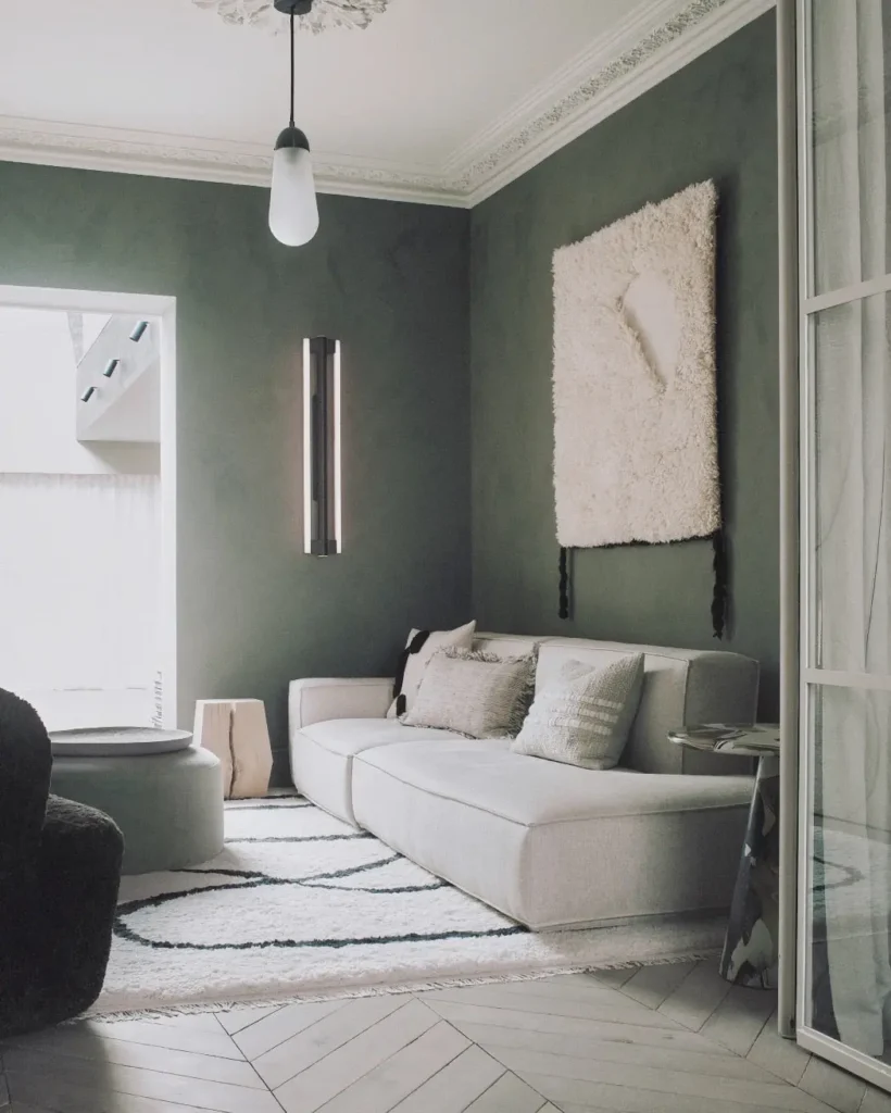
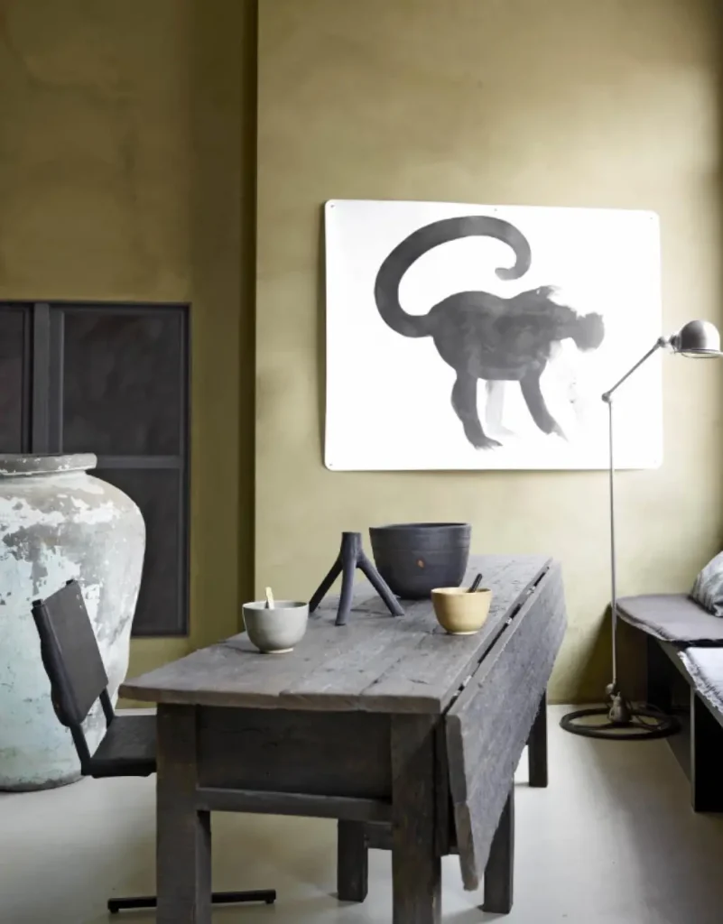
Soft olives, khakis and brown-based greens are becoming the new neutrals. Calm and natural, they are versatile enough to cover an entire room rather than being reserved for a single feature wall. Olive is a mid khaki shade with a soft, slightly “dirty” green character, while Broadbean offers a gentler interpretation. For a stronger and moodier effect, consider Hawthorn or Prickly Pear.
Earthy greens pair especially well with walnut, oak, linen, aged metal and natural stone. They work beautifully in living rooms, bedrooms and home offices, where the aim is to create a peaceful atmosphere without relying on pale or colourless neutrals.
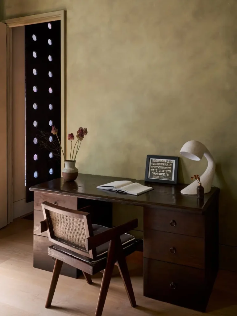
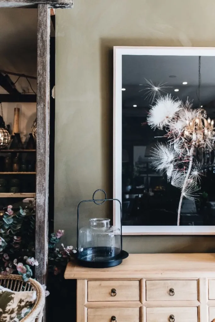
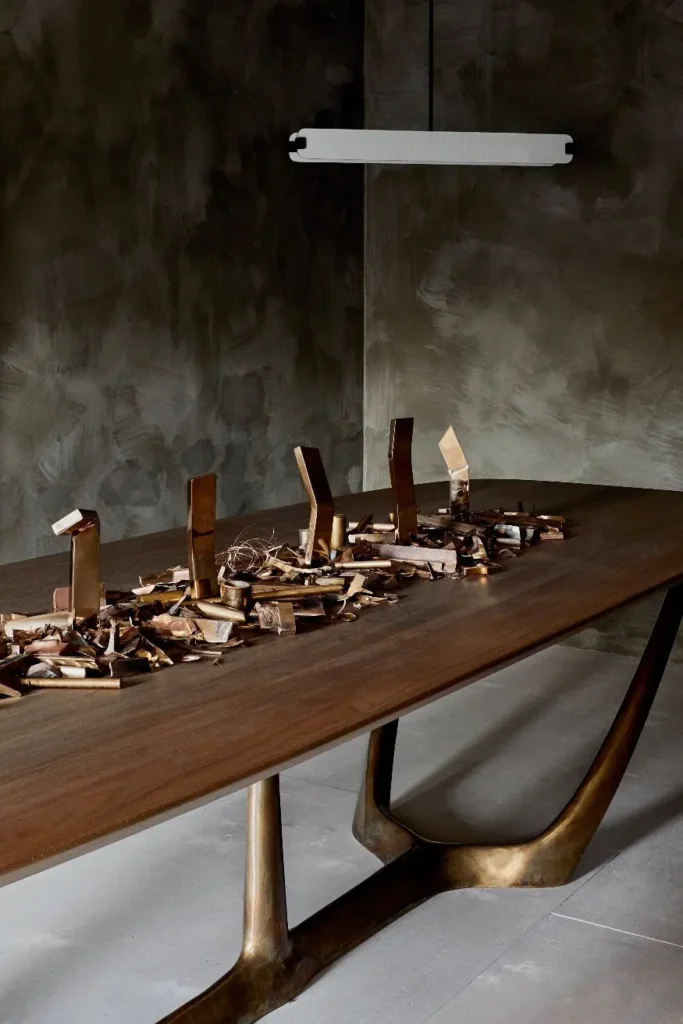
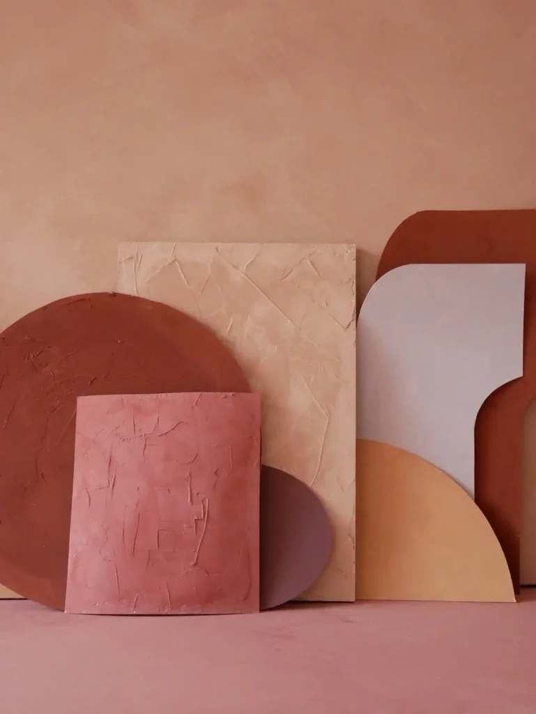
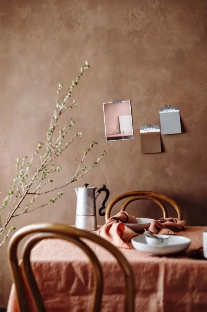
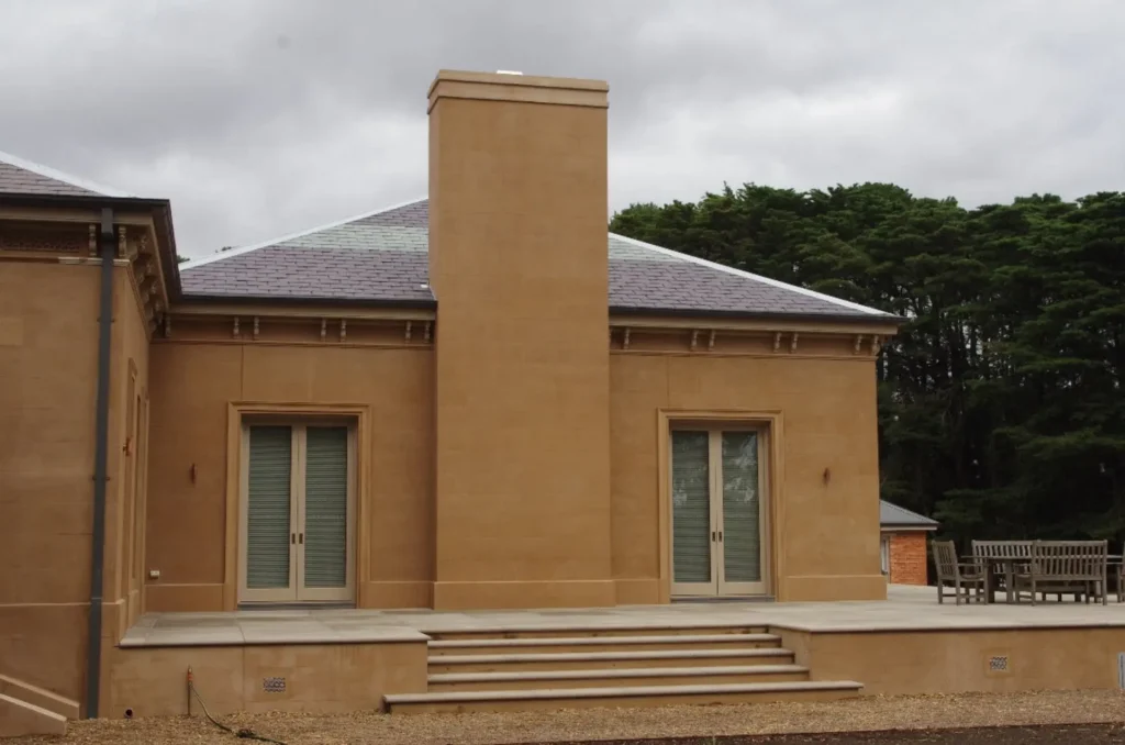
Terracotta returns this autumn in softer, more refined variations. Rather than vivid orange, the season’s palette draws inspiration from aged roof tiles, raw clay and walls with a naturally weathered patina. Moorland is a rich, warm terracotta, while Cinnabar offers a softer interpretation of the colour. Medlar leans towards a lighter, peachier tone, while Persimmon creates a stronger red-terracotta finish.
These shades work particularly well in dining rooms, entrance halls and living spaces. Pair them with off-white ceilings, dark timber, handmade ceramics and bronze or brass lighting for a warm, layered interior.
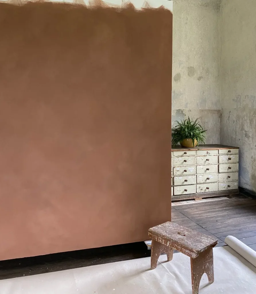
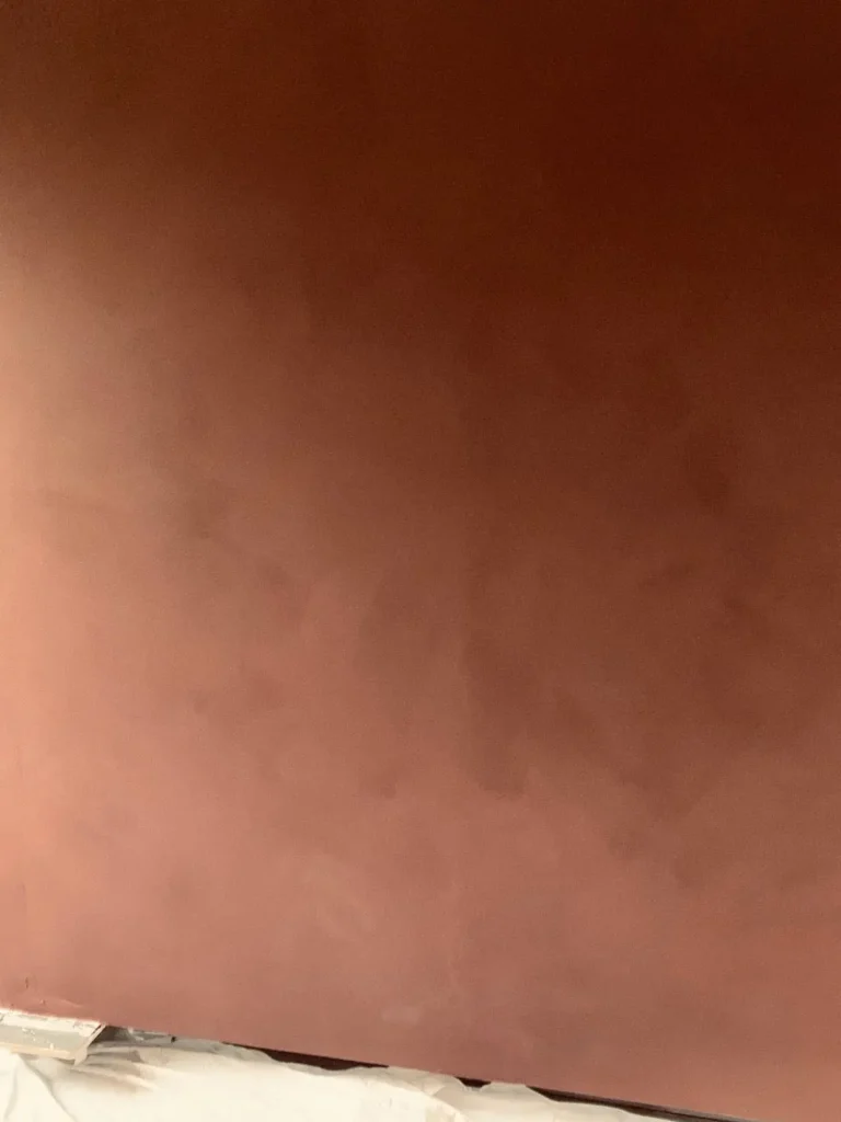
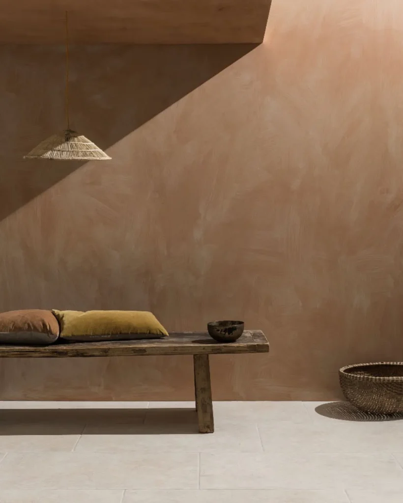
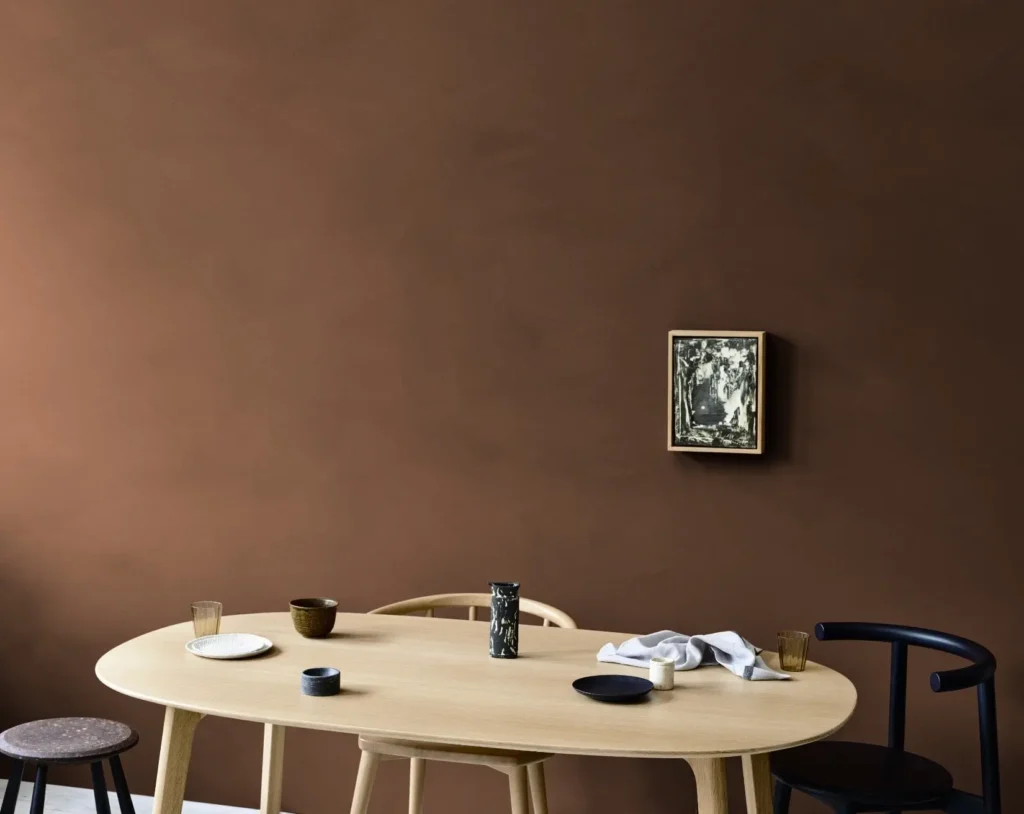
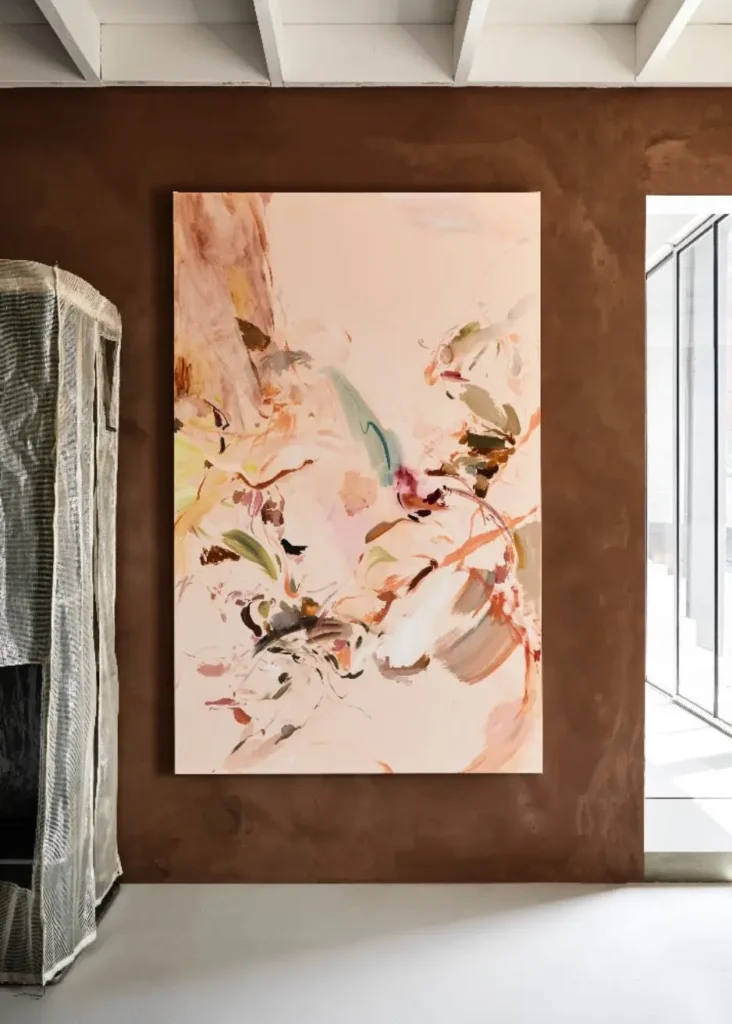
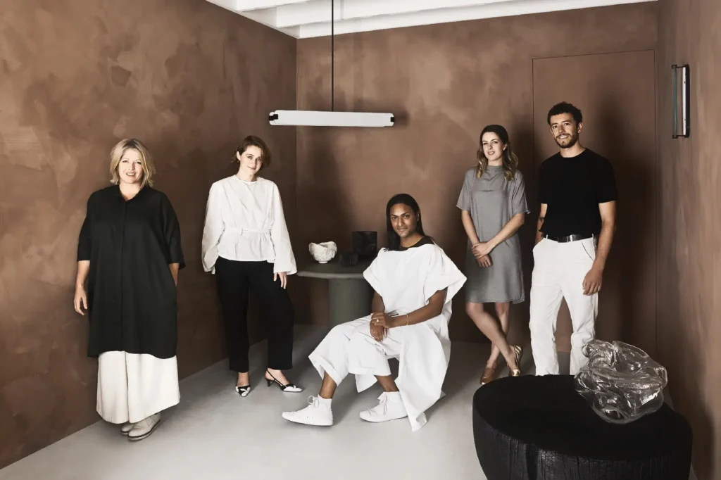
Brown is one of the strongest colour trends of 2026. These rich, nuanced shades have red, golden, or grey undertones that shift subtly as the light changes throughout the day. Tobacco recalls the colour of roasted coffee beans and warms up a room. Hazelnut is softer and more understated, while Caramel sits within a warm brown-beige palette, offering a lighter alternative. Chestnut has a subtle red undertone that adds depth and works especially well in Hygge and Wabi-Sabi interiors.
In a small room, a mid-tone brown can create a warm and inviting atmosphere. In larger spaces, brown pairs beautifully with cream, beige and khaki, as well as natural materials such as timber, stone, linen and leather. Use deeper tones on a single feature wall, while lighter shades work well throughout the room, adding character without making the space feel dark.
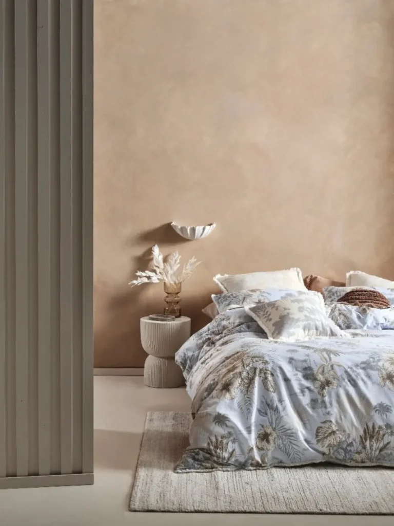
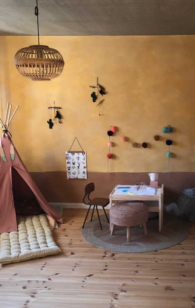
The ochres of 2026 are soft, earthy, and more atmospheric than bright yellows. Quince draws inspiration from autumn quince and has a natural, deep ochre tone. Beach Grass sits between ochre and clay, while Sienna brings a warmer yellow undertone. Barleycorn completes the palette with a warm yellow-brown shade reminiscent of earth and dried grasses.
These colours can brighten rooms with limited natural light and pair beautifully with timber, rattan, linen, black accents and warm off-whites. They work particularly well in kitchens, dining rooms and children’s rooms, creating warmth without making the space feel overly bright or intense.
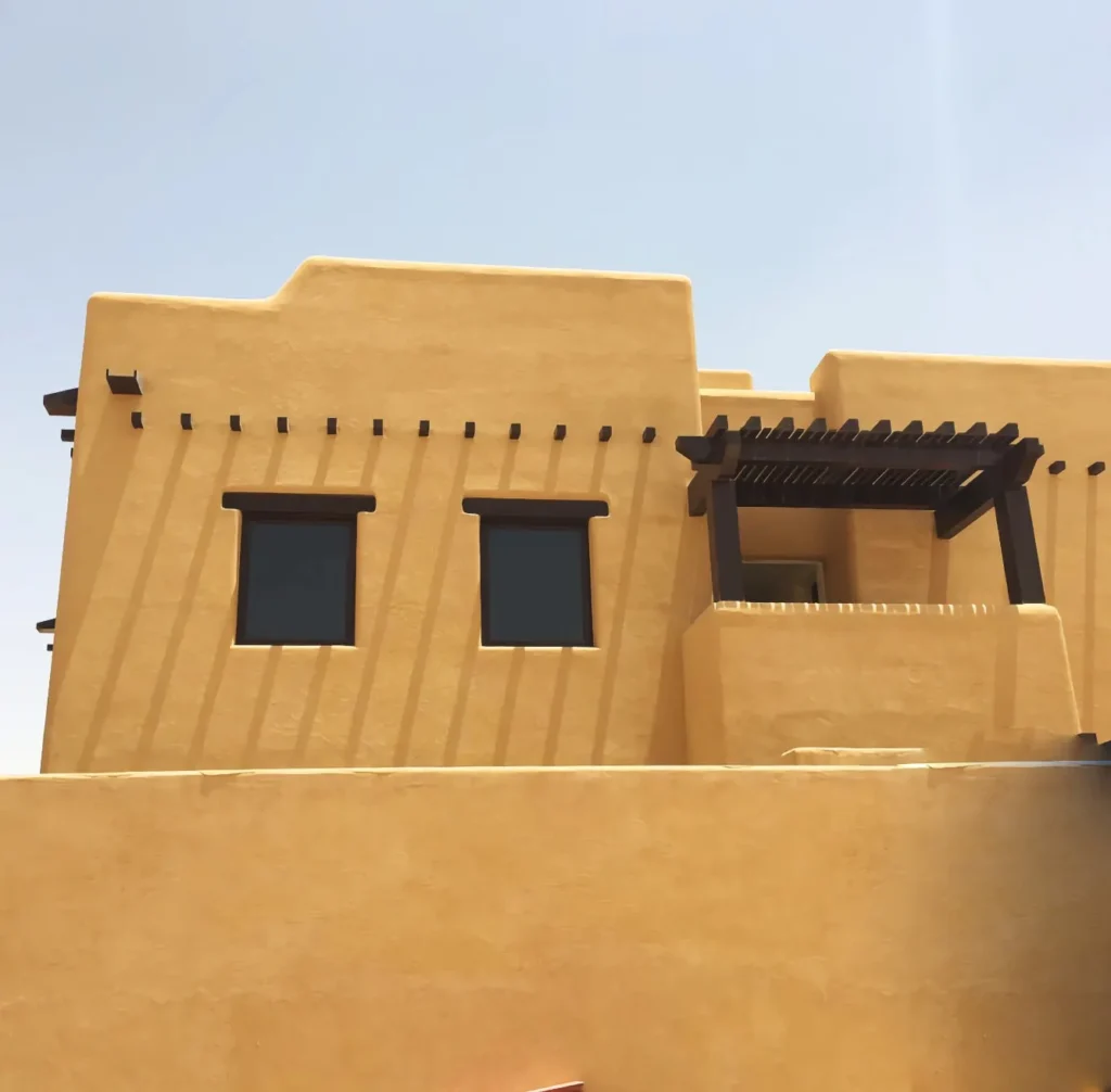
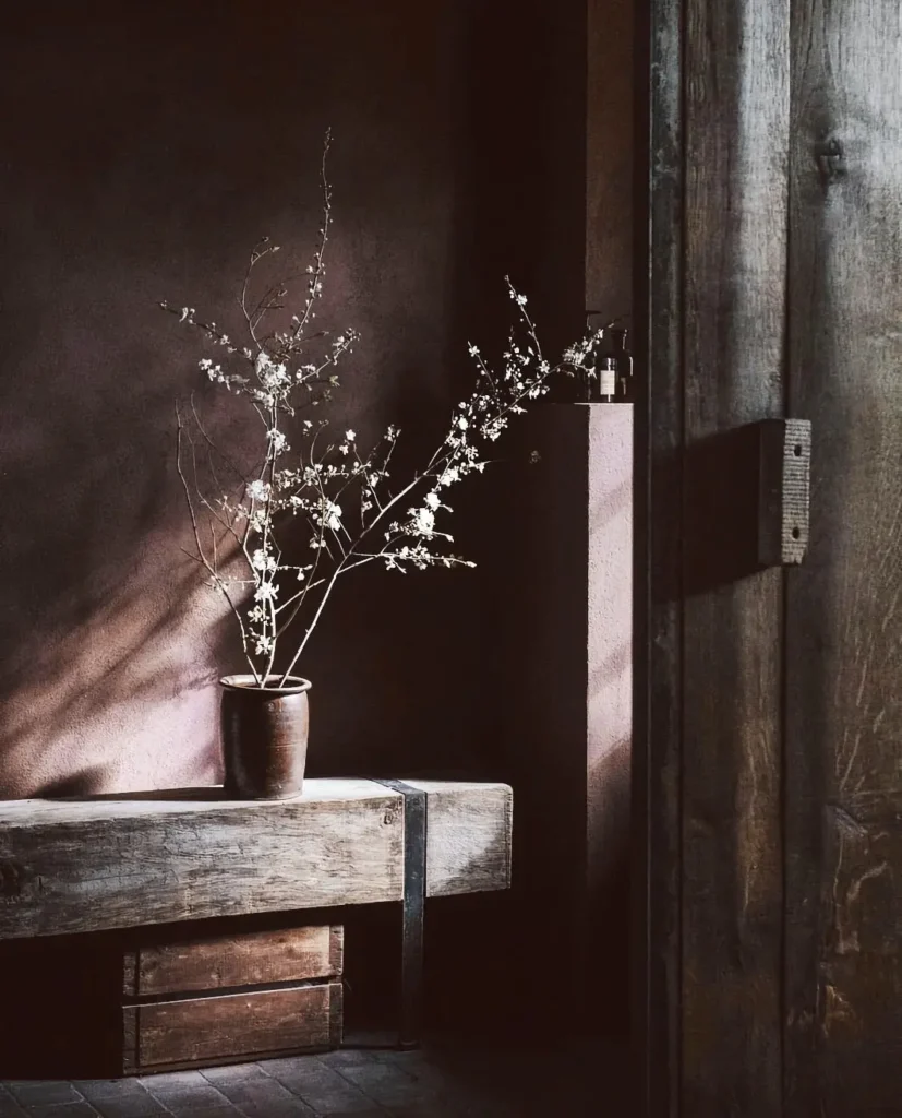
This autumn’s deep reds move away from bright, clear hues in favour of richer, earthier variations. Ground is a red-brown shade reminiscent of soil after rain. Henna is darker and more intense, with the warmth of natural henna pigment. Pheasant offers a softer, earthier red, while Bloodwood is a deep red with a cool undertone, ideal for a bolder and more atmospheric interior.
These colours work beautifully on a feature wall or in dining and living spaces, where they add warmth and depth. Pair them with dark timber, leather, natural stone, bronze accents and soft neutrals. In rooms with plenty of daylight, they appear more vibrant, while in the evening they create a warm, enveloping atmosphere.
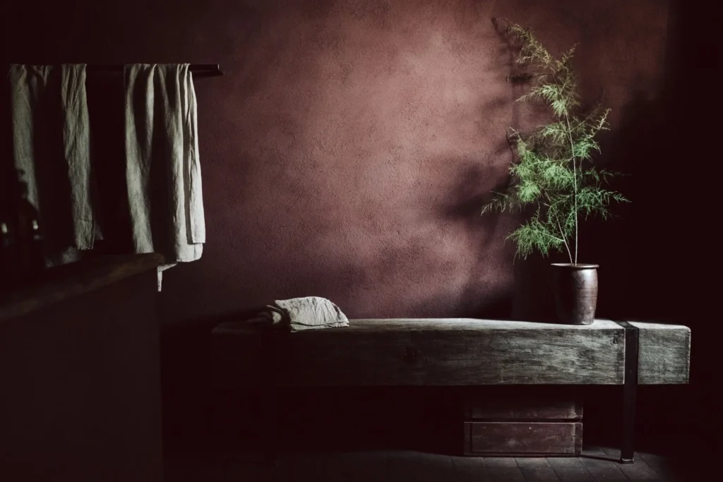
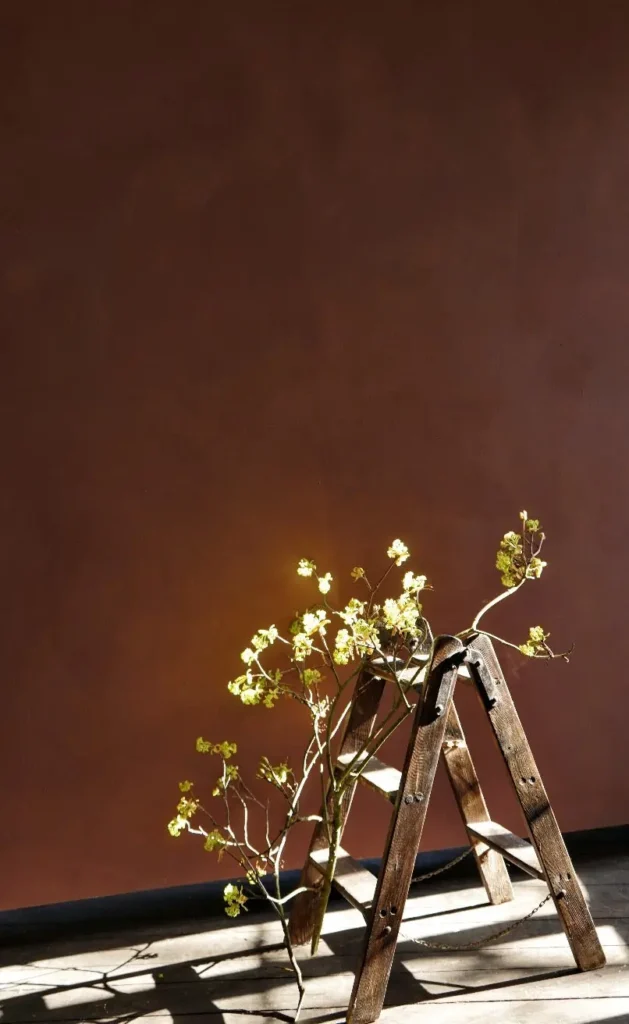

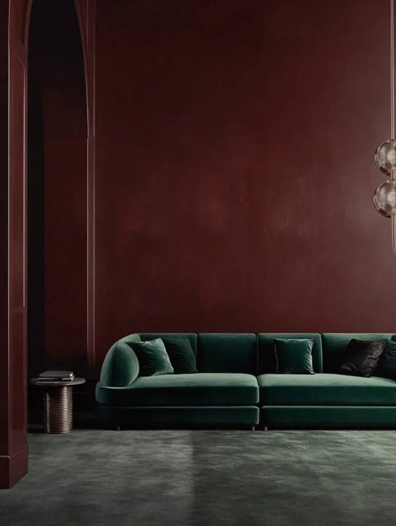
Limewash responds to both natural and artificial light, which means the same colour can change noticeably throughout the day. Before making a final choice, test a sample across a sufficiently large section of the wall and observe it in the morning, afternoon and evening. Consider the flooring, timber and textiles already in the room: warm surfaces will strengthen earthy notes, while cooler elements may reveal grey or green undertones.
Autumn 2026 earthy wall colours do not need to be limited to a feature wall. The natural variation of limewash allows even deeper tones to retain movement and luminosity. Whether you choose olive green, terracotta, ochre, tobacco or a rain-soaked red, the result can feel contemporary, calming and enduring — a considered interior palette designed to last well beyond a single season.